Introduction
Oscar Wilde once said that “conversations about the weather are the last refuge of the unimaginative.” After living in so many places, I came to realize that conversing about the weather speaks not so much about how dull we are, but rather reveals more about how famously unpredictable and abysmal the local weather can be. Locals in SF and Sacramento rarely talk about the weather, since there is little variability to it. On the other hand, in New York, the weather can be extremely bipolar and unpleasant. It is unsurprising then that weather for New Yorkers is a big conversation starter, since it allows people to share in their misery regarding the frigid cold or the unending rain. For instance, the first entry when you do a search for Binghamton, a town in NY state where I did my graduate work, in Urban Dictionary is this one:
Imagine Hell, then make it cold.
I’ve been a big admirer of design principles behind weather radials, so I decided to recreate some of the charts found on weather-radials.com using R and ggplot2. I used the weatherData package, which has some very easy to use wrapper functions for downloading the weather data from Weather Underground
library(weatherData) #for downloading the weather data
library(dplyr)
library(ggplot2)
library(viridis)
library(scales)
library(lubridate)
library(highcharter) #for datetime_to_timestamp function
First, we’re going to download the daily temperature data for year 2015.
bing <- getWeatherForDate("BGM", "2015-01-01","2015-12-31",
                          opt_all_columns = TRUE)
sac <- getWeatherForDate("SAC", "2015-01-01","2015-12-31",
                         opt_all_columns = TRUE)


#create a column for city
bing$city<-"Binghamton"
sac$city<-"Sacramento"

#remove EST and PST colums
bing<-bing %>% select(-EST)
sac<-sac %>% select(-PST)

#combine the two dfs
weather_Data<-rbind(bing,sac)
Do some data pre-processing.
#create weather vars
weather_Data <- weather_Data %>%
  mutate(date2 = as.Date(ymd(Date)))

#replacing the T and 0 values for precipitation with NA and changing it to numeric
weather_Data$PrecipitationIn[weather_Data$PrecipitationIn == "T"] <- NA
weather_Data$PrecipitationIn[weather_Data$PrecipitationIn == "0"] <- NA
weather_Data$PrecipitationIn<-as.numeric(weather_Data$PrecipitationIn)
The Result
#plot radial
weather_Data$PrecipitationIn[weather_Data$PrecipitationIn == "0"] <- NA
ggplot()+
    geom_line(data=weather_Data,
              aes(x=date2, y=Mean_TemperatureF, color=Mean_TemperatureF),
              size=2)+
    scale_color_viridis(option = "B", limits=c(0, 100),
              guide = guide_colourbar(title = "Temp (F)")) +
    geom_point(data=weather_Data,
               aes(x=date2, y=90, size=PrecipitationIn),
               alpha= .25)+
    scale_x_date(labels = date_format("%b"), breaks = date_breaks("month")) +
    scale_size_area(max_size = 10, breaks = seq(0,3,.5),
                    guide = guide_legend(title = "Precipitation (inches)")) +
    coord_polar() +
    theme_minimal() +
    scale_y_continuous(breaks = seq(0,100,20),
      labels=sprintf("%sF", seq(0, 100, by=20)),limits=c(0,120))+
    theme(legend.position = "right",
          plot.title = element_text(hjust = 0.5),
          plot.subtitle=element_text(hjust = 0, size=10),
          plot.caption=element_text(hjust = 0, size=8))+
    labs(title = "Binghamton (NY) and Sacramento (CA) Weather Radials (2015)",
       subtitle = "The area of the inner most circles contain the temperatures from 0-20 F and consecutively larger circles contain an additional 20F. \nThe brightly colored lines represent the daily mean temperature for each location",
       x = NULL, y = NULL) +
    facet_wrap(~city)+labs(caption = "Note that Sacramento recieves very little precipitation, while Binghamton has pretty much all year-round rainy/snowy weather.")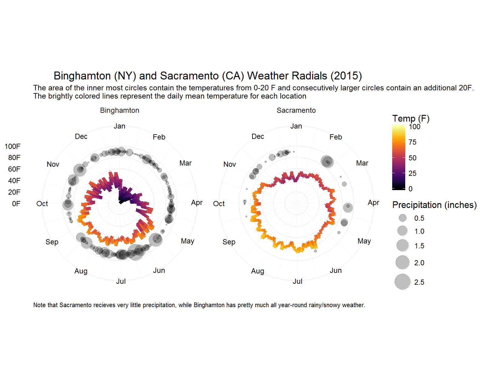
You can note that Sacramento barely gets any rain and that Binghamton had about a 6-month long winter last year, with very large inter-day temperature spikes.
If you’re interested in creating animated radials, I recommend that you check the highcharter package developed by Joshua Kunst.
Despite the unpredictable weather and low temperatures, it might be surprising to know that bad weather is generally associated with better productivity and increased performance at cognitive tasks that require focused attention (see Lee and colleagues, 2014).
comments powered by Disqus