Introduction
There has been a lot of discussion in the media about gender pay gap. Only a few months ago, President Obama has mentioned that women earn only 79 cents for every dollar earned by male counterparts. Although this is a considerable improvement over the era of Mad Men (i.e., 1960s-70s), the bigger issue that often goes unappreciated is the gender employment gap. The employment gap represents a diminished labor force participation rate among women relative to men.
Since I will be moving to SF soon, I wanted to find out the situation in regard to gender pay and employment gap. My impression of SF is that it is one of the most culturally progressive and diverse cities in the US. Nonetheless, as I found out, it is not immune to the gender gap issues that plague the rest of the US.
Here is what we hope to accomplish in this post:
- We’ll use the SF City salary data, which contains the names, positions, agency, and the compensation for each individual within the SF city government.
- Then we’ll try to predict the gender of an employee based on their name.
- We’ll examine how many males and females are employed within the SF city government.
- Lastly, we’ll examine the gender pay gap and examine the pay and employment gap differential.
The Data
You can find the data here. It contains the salary data for SF for the periods 2011-2014. There are close to 150k records, though the number of employees is actually smaller than that. The data contains the records only for employees part of the city government, so we can’t draw any conclusions about the private sector. You can also find a compiled dataset on Kaggle.
Libraries
I’ll be using the following libraries:
#load packages
pacman::p_load(ggplot2, reader, gender,ggthemes,
               GGally, stringr,dplyr,tm, DT, plotly, ggalt, tidyr,
               scales)
#check that packages were loaded
pacman::p_loaded(ggplot2, reader, gender,ggthemes,
                 GGally, stringr,dplyr,tm,DT, plotly, ggalt, tidyr,
                 scales)
## ggplot2 reader gender ggthemes GGally stringr dplyr tm
## TRUE TRUE TRUE TRUE TRUE TRUE TRUE TRUE
## DT plotly ggalt tidyr scales
## TRUE TRUE TRUE TRUE TRUEData loading, feature creation, cleaning, pre-processing
salaries<-read.csv("Salaries.csv", na.strings=c("Not Provided"," ",""),
                   strip.white = TRUE)
Let’s convert all the names to lower character and remove all punctuation.
salaries$EmployeeName<-tolower(salaries$EmployeeName)
salaries$EmployeeName<-removePunctuation(salaries$EmployeeName)
#strip the left white-space
salaries$EmployeeName<-trimws(salaries$EmployeeName, which="left")
Now, let’s remove one letter strings. We’re removing the one or two letter words that represent middle initial or other title (e.g., Dr.). We are doing this cleaning because the naming convention for an employee is not always consistent from year to year. For example, lets look at a transit operator named Aaran Luo:
filter(salaries, grepl('aaran', EmployeeName)) %>%
    select(EmployeeName, JobTitle, Year, TotalPay)
## EmployeeName JobTitle Year TotalPay
## 1 aaran y luo Transit Operator 2014 75252.84
## 2 aaran luo Transit Operator 2012 78118.96
## 3 aaran y luo Transit Operator 2013 82026.78There are two conventions for how the employee name was recorded : aaran y luo or aaran luo. It would be highly unusual for these naming conventions to actually represent two different employees. Hence, I remove all the middle initial characters from the EmployeeName variable.
salaries$EmployeeName <- gsub(" *\\b[[:alpha:]]{1}\\b *", " ",
                              salaries$EmployeeName)

#now we need to remove cases with double white-space and replace them with single white space
salaries$EmployeeName <- gsub("  ", " ",
                              salaries$EmployeeName)
Now, let us create a new variable with the first names.
salaries$name<-word(salaries$EmployeeName, 1)Let’s use the Social Security Administration(ssa) gender data that represents the names prevalent in United States from 1930 to 2012. If you’re using the ssa for the first time, you’ll need to wait a little bit for the genderData dependency to install.
genderDF<-salaries %>%
  distinct(name) %>%
  do(results = gender(.$name, method = "ssa")) %>%
  do(bind_rows(.$results))

mergedDF<-salaries %>%
  left_join(genderDF, by = c("name" = "name"))

rm(genderDF)
rm(salaries)
Now, let’s examine if there are any outliers present in the data. I’ll examine if there are any unusual values in total pay. First, I’ll examine the top 10 observations for total pay and the bottom 10 observations in total pay.
mergedDF %>% select(EmployeeName,JobTitle, TotalPayBenefits) %>%
    arrange(desc(TotalPayBenefits)) %>%
    head(10)
## EmployeeName JobTitle
## 1 nathaniel ford GENERAL MANAGER-METROPOLITAN TRANSIT AUTHORITY
## 2 gary jimenez CAPTAIN III (POLICE DEPARTMENT)
## 3 david shinn Deputy Chief 3
## 4 amy hart Asst Med Examiner
## 5 william coaker jr Chief Investment Officer
## 6 gregory suhr Chief of Police
## 7 joanne hayeswhite Chief, Fire Department
## 8 gregory suhr Chief of Police
## 9 joanne hayeswhite Chief, Fire Department
## 10 ellen moffatt Asst Med Examiner
## TotalPayBenefits
## 1 567595.4
## 2 538909.3
## 3 510732.7
## 4 479652.2
## 5 436224.4
## 6 425815.3
## 7 422353.4
## 8 418019.2
## 9 417435.1
## 10 415767.9It seems like we have some individuals who earn more than half a million dollars in pay, which is not that unusual considering the seniority of their positions and that SF is one of the most expensive cities in the US. It is interesting that there are some Assistant Medical Examiners in the list that earn 400k. If you check the following link on indeed.com, you’ll note that this job title generally gets about $65K a year in SF, so it is unusual to have people with that title earning close to $400k. Nontheless, after some googling, I found out the reason why these employees get paid so much. They are all medical pathologists, who have to do autopsies on cadavers involved in criminal cases. Ummm….yeah, I imagine there aren’t that many people who specialize in cutting dead people up, so it makes sense that they get paid a lot.
With that aside, let’s check the lowest salaries.
mergedDF %>% select(EmployeeName,JobTitle, TotalPayBenefits) %>%
    arrange(desc(TotalPayBenefits)) %>%
    tail(10)
## EmployeeName JobTitle TotalPayBenefits
## 148645 kaukab mohsin TRANSIT OPERATOR 0.00
## 148646 josephine mccreary MANAGER IV 0.00
## 148647 not provided Not provided 0.00
## 148648 not provided Not provided 0.00
## 148649 not provided Not provided 0.00
## 148650 not provided Not provided 0.00
## 148651 timothy gibson Police Officer 3 -2.73
## 148652 mark laherty Police Officer 3 -8.20
## 148653 david kucia Police Officer 3 -33.89
## 148654 joe lopez Counselor, Log Cabin Ranch -618.13We have a bunch of issues. First, we have three persons with negative pay. Also, we have some rows which should’ve been tagged as NA data (the not provided rows). Third, we have individuals who have 0 pay. Let’s remove the not provided rows and the entries for individuals with negative pay and then we’ll tackle individuals who had 0 pay.
#remove not provided rows
mergedDF<-mergedDF %>% filter(EmployeeName!="not provided")

#remove joe lopez
mergedDF<-mergedDF %>% filter(TotalPayBenefits>=0)

#check the rows with Total Pay of 0
zeroPay<-mergedDF %>% filter(TotalPayBenefits==0) %>%
    select(EmployeeName,JobTitle,TotalPayBenefits)
nrow(zeroPay)
## [1] 26We have 26 individuals who had 0 pay. One reason why their pay was 0 is that they just registered as employees and did not receive a salary yet. Another reason is that they are registered as employees, but had to take a sabbatical with no pay. Regardless of the reason, the number of people with zero pay is really small (less than .01% of the data) and we can feel safe removing them.
mergedDF<-mergedDF %>% filter(TotalPayBenefits!=0)Even though we removed employees with zero pay, we still need to explore if there are individuals who received really low pay. Let’s examine the distribution of the TotalPayBenefits variable in order to answer that question. I will break the distribution of total pay by Status (Full Time, Part Time, NA)
#rename the levels of the status variables into more interpretable variable names
mergedDF$Status<-plyr::revalue(mergedDF$Status,
                c("FT"="Full Time", "PT"="Part Time"))

#find the mean salary for each employee in the dataset
salary_employee<- mergedDF %>%
    group_by(EmployeeName, gender,
             proportion_male, proportion_female, Status) %>%
    summarise_each(funs(mean), BasePay, OvertimePay, OtherPay,
                   Benefits, TotalPay, TotalPayBenefits)

theme_set(theme_solarized())
ggplot(salary_employee, aes(x=TotalPayBenefits/1000)) +
    geom_histogram(aes(y = ..density..),
                   binwidth=density(salary_employee$TotalPayBenefits/1000)$bw) +
    geom_density(fill="green", alpha = 0.2)+
    facet_grid(.~Status)+
    scale_x_continuous(breaks = seq(0,300,50), limits = c(0, 300))+
    ggtitle("Density distributions for compensation for each work status")+
    labs(y = "Density", x="Compensation (thousands)")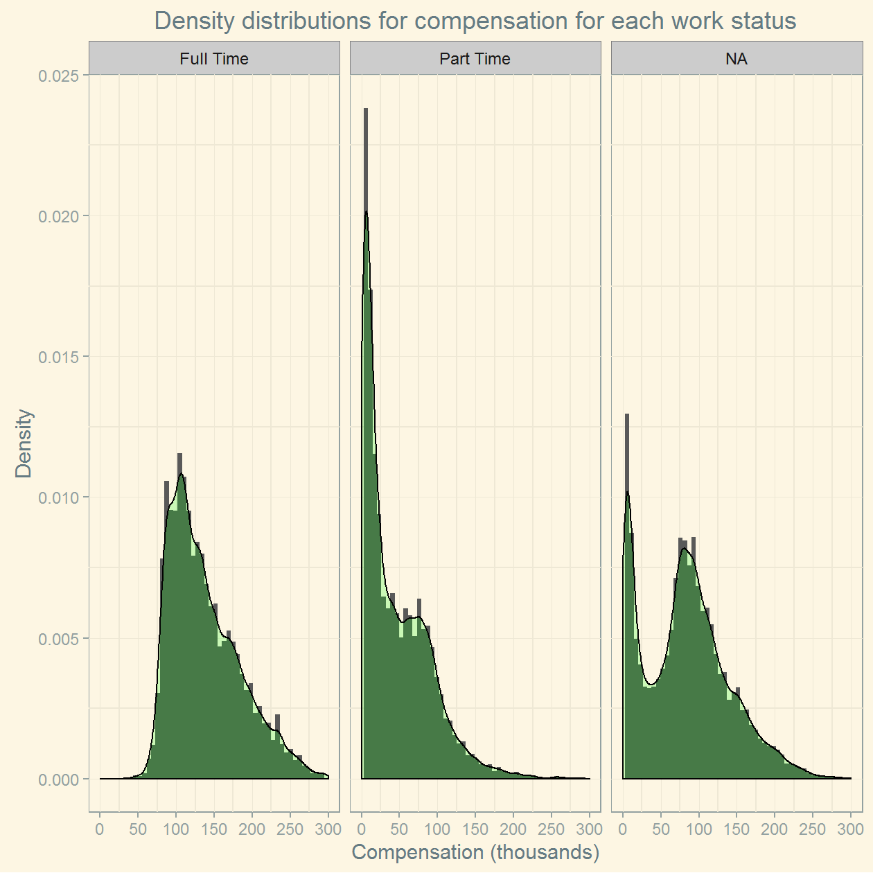
The NA responses have a mixture of part-timers and full-timers (note the bimodality in the distribution of responses). There are a couple observations to be made:
- The full time employees generally seem to earn at least 50k salary.
- The part time employees have a much wider range in salary, with salaries starting at near 0 to 300k.
Gender Pay and Employment Gap
Let’s look at the gender counts for employees in each job status
#remove data for which no gender is available; this removed about 10,000 observations.
genderDF<-salary_employee %>%
    filter(!is.na(gender)) #filter the NA gender

(nrow(salary_employee)-nrow(genderDF))/nrow(salary_employee)
## [1] 0.0703819#we removed about 7% of the data with names for which we don't have gender informationLet’s plot of the counts for the number of male and female employees broken down by work status. I include here also employees with work status NA, simply because they represent almost half of our data, and it would be unjustifiable to just ignore such a large number of data points.
countsDf<-genderDF %>% count(Status, gender)

counts<-ggplot(data=countsDf, aes(x=Status, y=n, fill=gender)) +
    geom_bar(stat="identity", position=position_dodge(), colour="black") +
    scale_fill_manual(values=c("#4EEE94", "#63B8FF"))+
    ggtitle("Number of employees by gender and work status")+
    labs(y = "# Employees", x="Status")+
    theme(plot.margin = unit(c(.25,.25,.25,.25), "cm"))

#set up the margins for future ggplotly functions()
m = list(
  l = 100,
  r = 100,
  b = 100,
  t = 100,
  pad = 4
)

ggplotly(counts) %>%
layout(autosize = F, width = 700, height = 500, margin = m)It seems like more females are working part time relative to males, although the difference is fairly small. Moreover, it seems like there are more male full time employees than part time female employees. This indicates that labor force participation among female workers is not as high as for male workers.
Let us check the pay distribution for full time and the part time male and female employees for each job status. The graph below will plot the box-plots for total compensation, broken down by gender and work status. Feel free to hover over the graph for interactivity. The diamonds represent the mean compensation.
#rescale the totalpaybenefits to thousands
genderDF$`Total Pay`<-genderDF$TotalPayBenefits/1000

genderSalaries<-ggplot(genderDF, aes(x=gender, y=`Total Pay`, fill=gender)) +
    geom_boxplot() +
    stat_summary(fun.y=mean, geom="point", shape=5, size=2) +
    facet_grid(.~Status)+
    scale_fill_manual(values=c("#4EEE94", "#63B8FF"))+
    ggtitle("Compensation by gender and status")+
    labs(y = "Compensation (in thousands)", x="Gender")+
    scale_y_continuous(breaks = seq(0,600,50),
            labels=sprintf("$%sK", comma(seq(0, 600, by=50))))+
    theme(plot.margin = unit(c(.25,.25,.25,.25), "cm"))+
    theme(legend.position="none")


ggplotly() %>% layout(autosize = F, width = 700, height = 500, margin = m)There are a few things one can gather from this graph.
- Full time female employees get paid on median 84 cents for every dollar earned by full time male employees. The median difference in salary is about $21,000 in absolute terms. The gap becomes a bit smaller when we compare the mean salary between male and female employees (about 89 cents/dollar).
- Part time female employees get paid on median 1.37 dollars for every dollar earned by part time male employees. Here the median difference is about $10,000. Nonetheless, the comparison for this group is a bit harder to justify, because we are dealing with a highly skewed distribution. For instance, out of part-time employees that earned less than $1000, the number of males is about 20% greater than the number of females.
- Female employees with uncategorized job status earn on median 81 cents for every dollar earned by male employees. Again, this number should be interpreted in the context of having a bimodal distribution, for which a median comparisons might not be justifiable.
Let’s find now the wages lost due to employment gap and gender pay gap for full time employees. Essentially, we want to find out how much is lost in potential wages because women are paid less and because the hiring rate for women is lower than for male.
#gender pay gap: find the median difference in salaries and multiply by the number of full time female employees
(136960-115520)*7833
## [1] 167939520#about 168 million are wages lost to gender pay
#employment gap: find the difference in number of male and female employees and multiply by the median female salary.
(12556-7833)*115520## [1] 545600960# about 546 million wage differential because of employment gap.The general conclusion we should draw from this dataset is that we don’t only have a gender pay gap for full time employees, but we also have an employment gap. The gender pay gap accounts for about 168 million dollars annually. On the other hand, the fact that we have fewer female employees leads to a total annual wage differential of 546 millions.
comments powered by Disqus